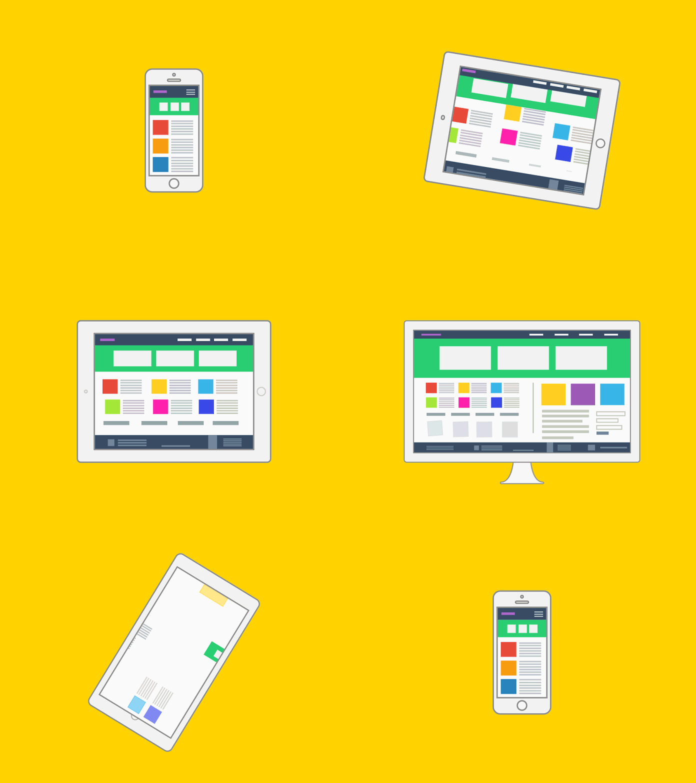

With Web users increasingly using mobile devices to browse Web sites and apps, Web designers and developers need to be sure that their creations look as good and work as well on mobile devices as on traditional desktop computers.
Our designs are for mobile devices as a primary target or as a nice extra, you can use the power of CSS to ensure that the same content can be accessed across all hardware platforms, from mobile phones to wide-screen high-resolution displays.
Our Design
This approach is known as “responsive Web design”. Some of its strategies include:
Liquid or fluid layout: Defining all container widths in terms of percentages of the browser viewport, so that they expand and contract as the browser window changes size.
Media queries: Invoking different style sheets based on the capabilities of the display being used, such as size, resolution, aspect ratio, and color depth.
Fluid images: Setting images to occupy at most the maximum display width.


